Achieving
the Absolutes.
CHALLENGE
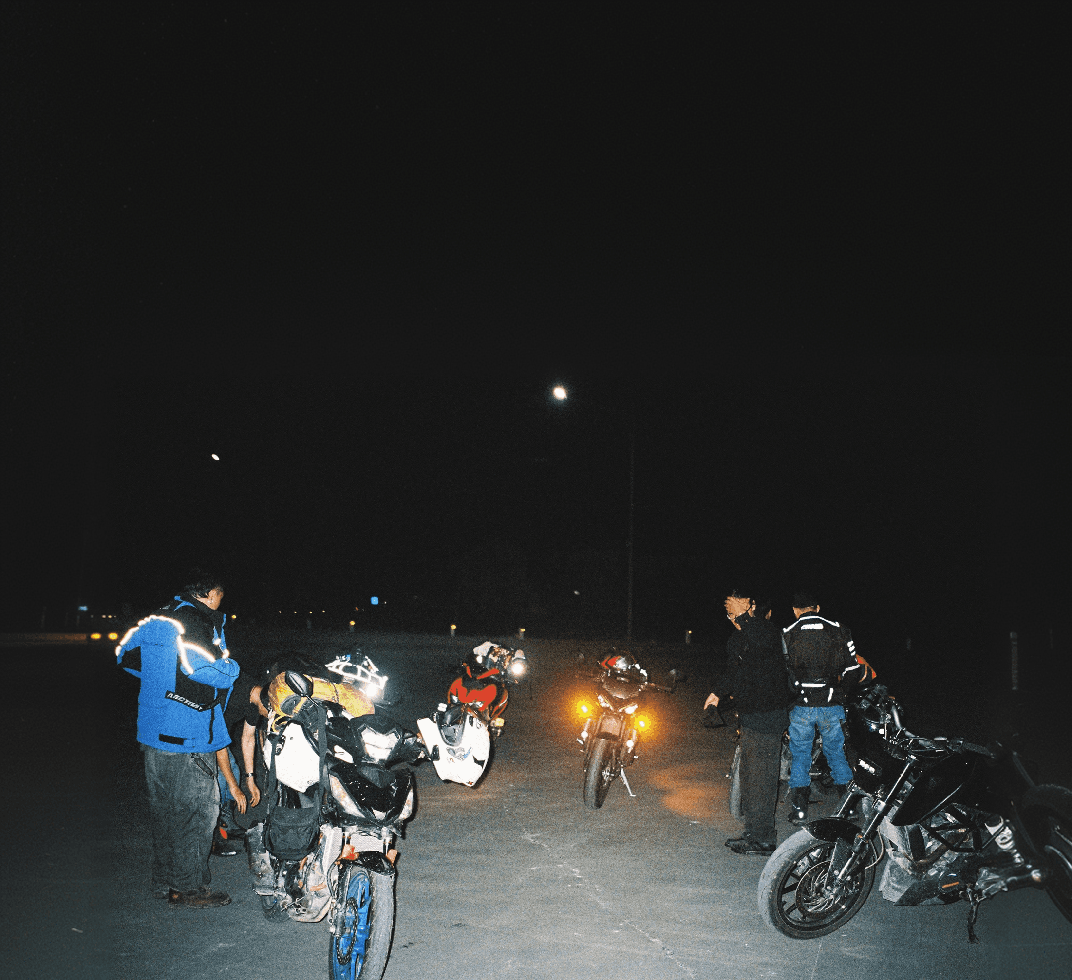
The motorcycle scene is saturated with a familiar visual language — aggressive italics, heavy slab serifs, and a loud aesthetic that bleeds together across brands. The brief for HAIBA was to break from that template entirely: build a fresh identity that feels energetic and dynamic without leaning on genre clichés, one that could scale across print, product, and digital touchpoints without losing coherence. The identity had to resonate immediately with a general audience while still carrying the specificity and edge that a niche club culture demands.


STRATEGY
The goal was to develop a masterbrand — not just a logo, but a complete visual system with enough internal logic to hold together across any medium or format. Rather than treating each application as a separate design problem, the system needed a single strong idea at its core that could flex without fracturing. Consistency of feeling over consistency of form.

EXECUTION
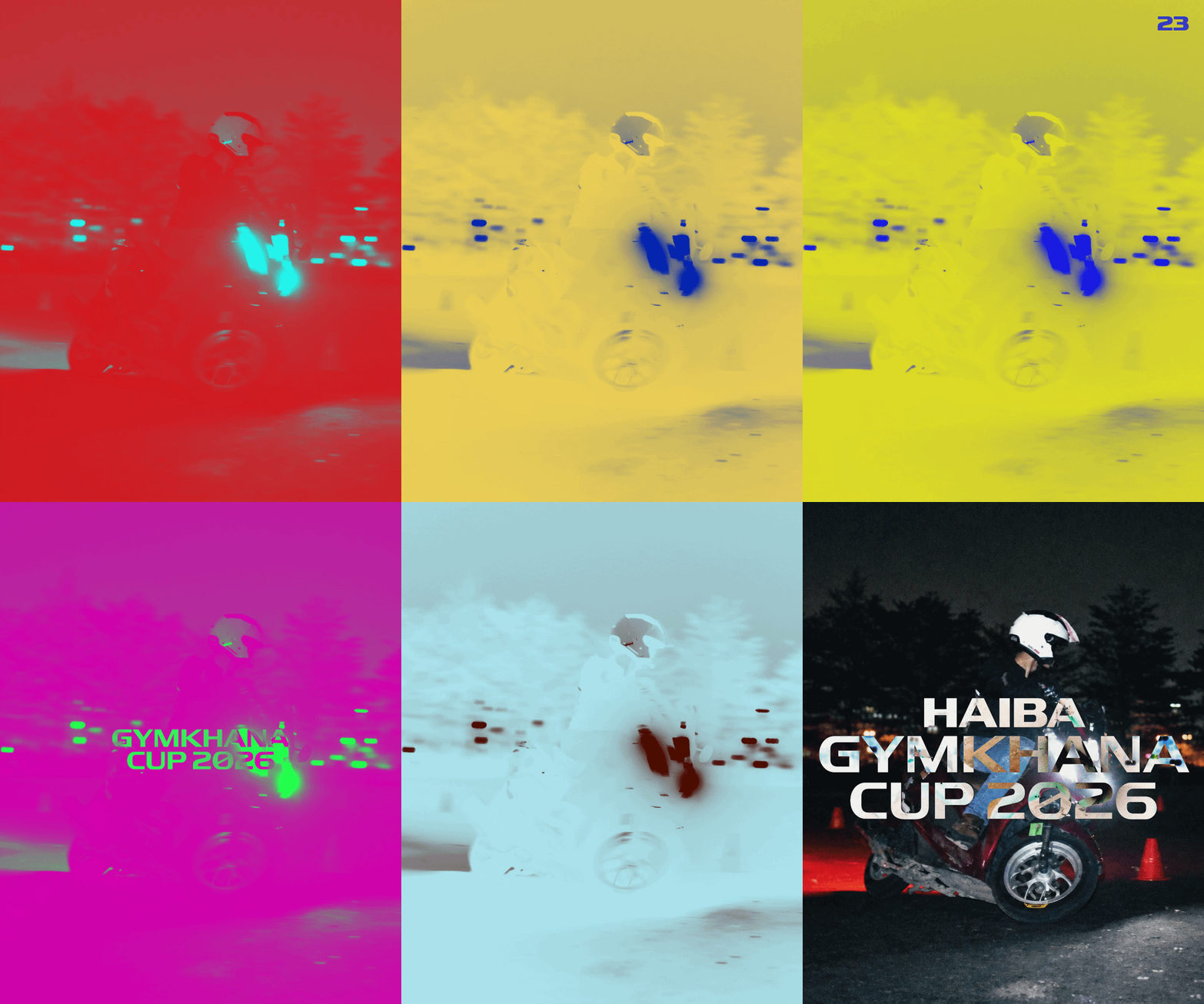
The search for the right typographic foundation was extensive. Multiple typefaces were tested and ruled out - each either echoed an existing brand too closely or lacked the distinctiveness needed to anchor a lasting identity. The breakthrough came with Record Laser by Sharp Type: a face with enough personality to carry the brand on its own, yet disciplined enough to function as a system component.
From that single typographic choice, a dynamic identity system was built — one governed by clear rules that allow it to adapt freely in size, format, and context while always reading as unmistakably HAIBA. Whether applied to a helmet, a printed collateral piece, or a merchandise tag, the system transfers the same feeling without needing to repeat the same layout.

OUTCOME
The club responded with immediate recognition - the identity captured the character of the club in a single glance. What was delivered wasn't just a visual refresh, but a coherent brand language the club could carry forward with confidence across every touchpoint.


